Case Study
Formulo
Why This Project Matters
Formulo was a healthcare-focused product where trust, clarity, and accessibility were critical. The project required simplifying complex workflows, understanding user behavior, and designing experiences that users could confidently rely on.
HealthTech
Mobile Product Design
User Experience Strategy
Problem framing
The Challenge
Users needed a healthcare experience that could guide them through skin concerns, consultation steps, and product recommendations without feeling confusing or risky. The business needed a flow that could build trust while reducing drop-off across onboarding and purchase decisions.
What existed
A multi-step healthcare workflow with high trust requirements and limited room for unclear guidance.
Why it mattered
In health-tech, uncertainty can quickly become abandonment. The experience had to feel reliable, accessible, and easy to follow.
Who was affected
Users seeking skincare support, especially people with limited time, low confidence, or limited access to specialists.
Business and user pain
Users needed confidence before sharing personal health information; the product needed clearer pathways to completion.
Understanding the Users
The research focus was to understand how people approach skincare decisions when medical confidence, time, and clarity all affect whether they continue or drop off.
Primary users
People seeking skincare support through a digital dermatology journey, especially users balancing time constraints with a need for trustworthy guidance.
Goals
Understand their skin concern, receive a clear recommendation, know what happens next, and feel confident before sharing personal details or purchasing.
Frustrations
Long flows, unclear medical language, lack of feedback, and uncertainty about whether recommendations are personalized enough to trust.
Constraints
The experience needed to remain accessible on mobile, reduce cognitive load, and communicate trust without overwhelming users with clinical complexity.
Key Insights
Research shifted the work from designing screens to designing confidence: every step had to help users understand where they were, why information was needed, and what outcome to expect.
01
Trust increased when users understood why each question was being asked.
02
Users needed visible progress and clear next steps during longer onboarding flows.
03
Plain language reduced hesitation more effectively than adding more visual detail.
04
The biggest opportunity was simplifying decision points before users reached checkout.
Design Decisions
The design work focused on reducing uncertainty at key moments. Each decision connected a user problem to a clearer path through the product.
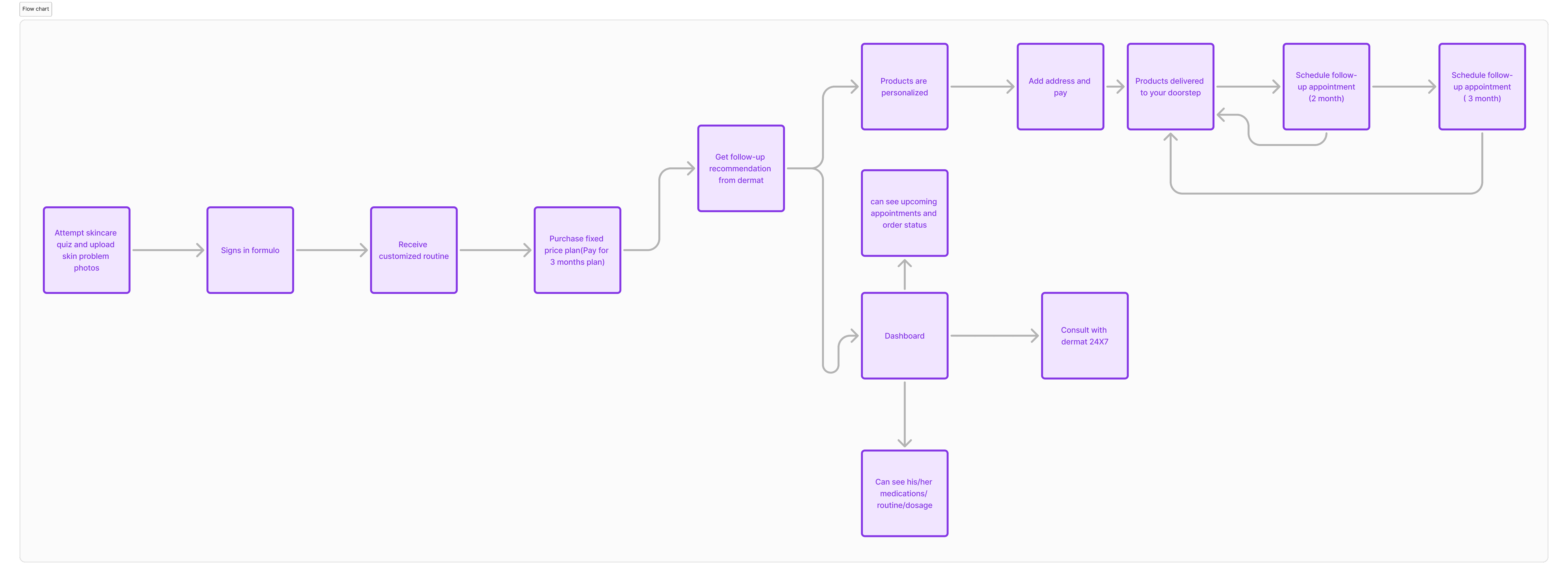
User Flow
Objective: Help users understand the end-to-end skincare consultation and purchase journey.
Decision: Map authentication, quiz completion, dermatologist consultation, and purchase into a clear sequence.
Impact: Reduced ambiguity by making the product flow easier to evaluate, simplify, and improve.
User Personas
Objective: Understand the needs of users seeking digital dermatology support.
Decision: Use survey findings to define a persona shaped by time constraints, specialist availability, and trust needs.
Impact: Grounded product decisions in real user motivations rather than only interface preferences.
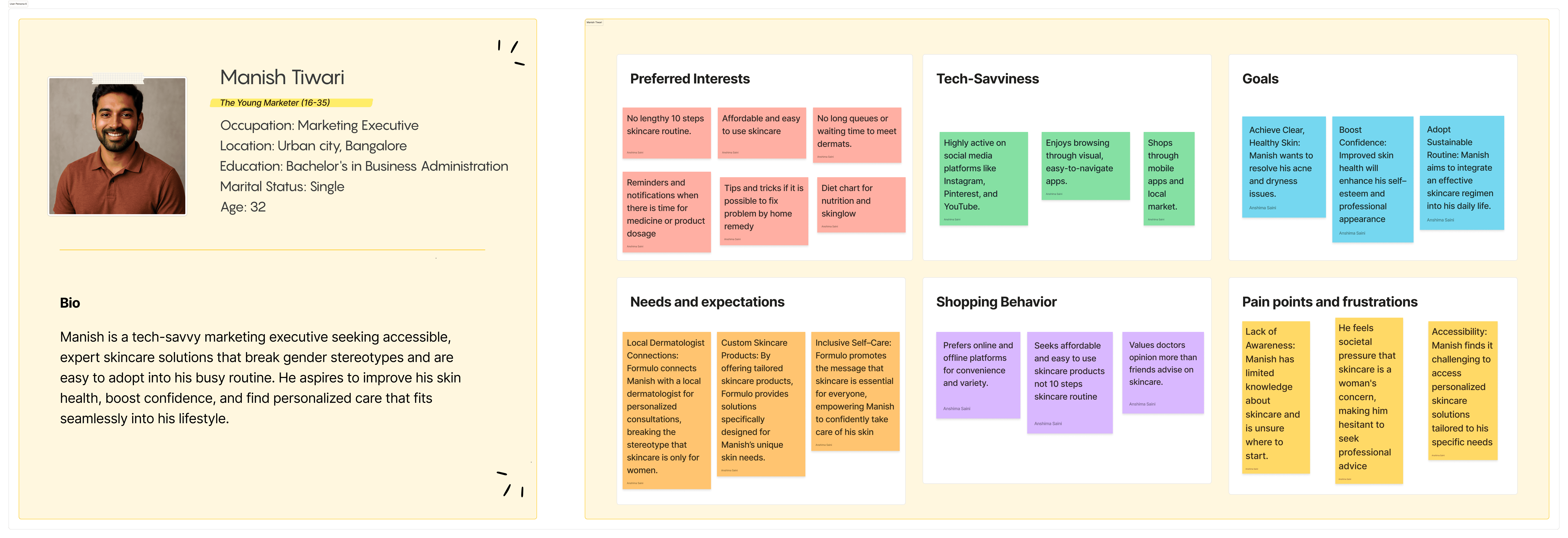

Priya Nair
The Self-Care Optimizer (24–35)
Occupation: Product Designer
Location: Urban city, Bangalore
Education: Master’s in Design
Marital Status: Single
Age: 29
Bio
Priya is a skincare-aware professional who wants credible, personalized routines without feeling overwhelmed by trends. She researches ingredients, compares reviews, and looks for dermatology-backed guidance that fits her work schedule and changing skin needs.
Preferred Interests
Wants routines that adjust around work stress and hormonal changes.
Looks for ingredient transparency before trying new products.
Prefers quick dermatologist guidance over endless scrolling.
Needs reminders for consistency, refills, and follow-ups.
Tech-Savviness
Uses Instagram, YouTube, and dermatologist reels for discovery.
Comfortable with mobile consultations and visual progress tracking.
Goals
Build a routine that treats acne marks and sensitivity gently.
Feel confident choosing products without trial-and-error.
Needs and expectations
A trustworthy diagnosis flow, product explanations in plain language, and a plan that adapts when her skin reacts or schedule changes.
Shopping Behavior
Compares online reviews, checks ingredient lists, prefers bundles, and values consultation-backed recommendations over influencer-only advice.
Pain points and frustrations
Too many conflicting routines, fear of irritation, hidden costs, and unclear next steps after a skin concern is identified.
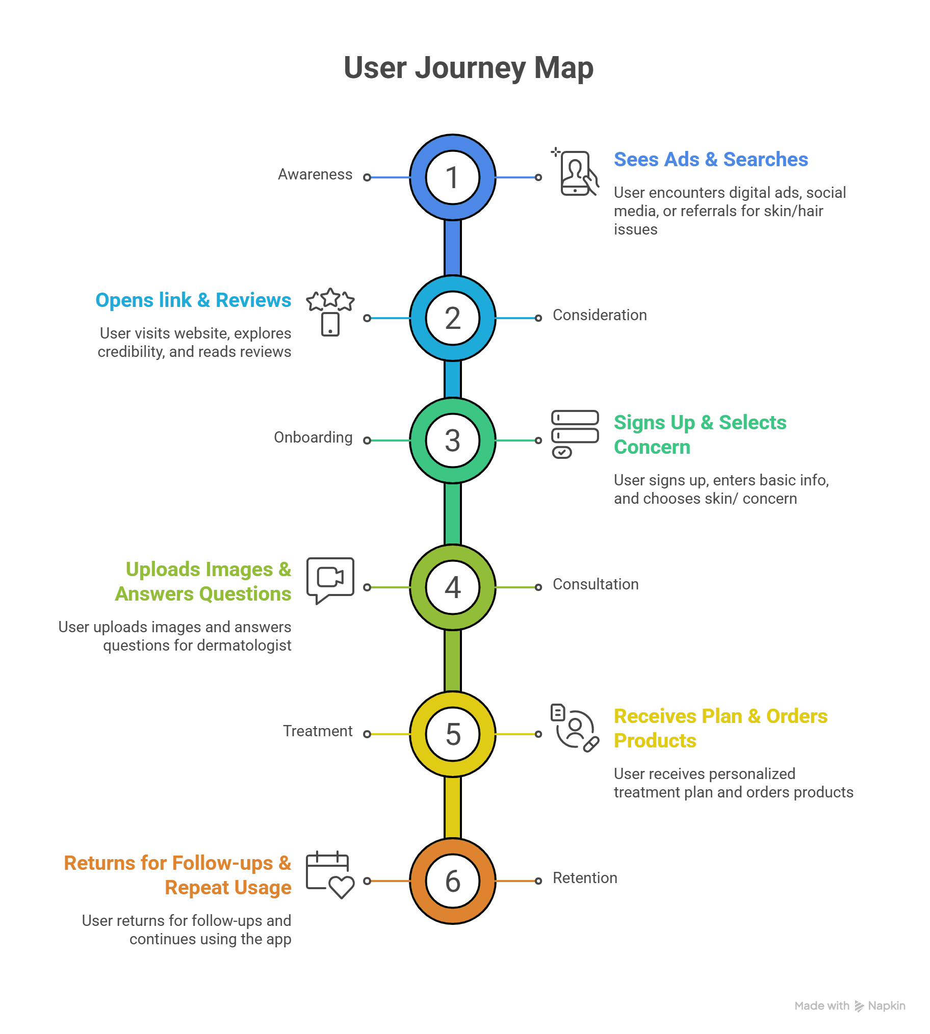
User Journey Map
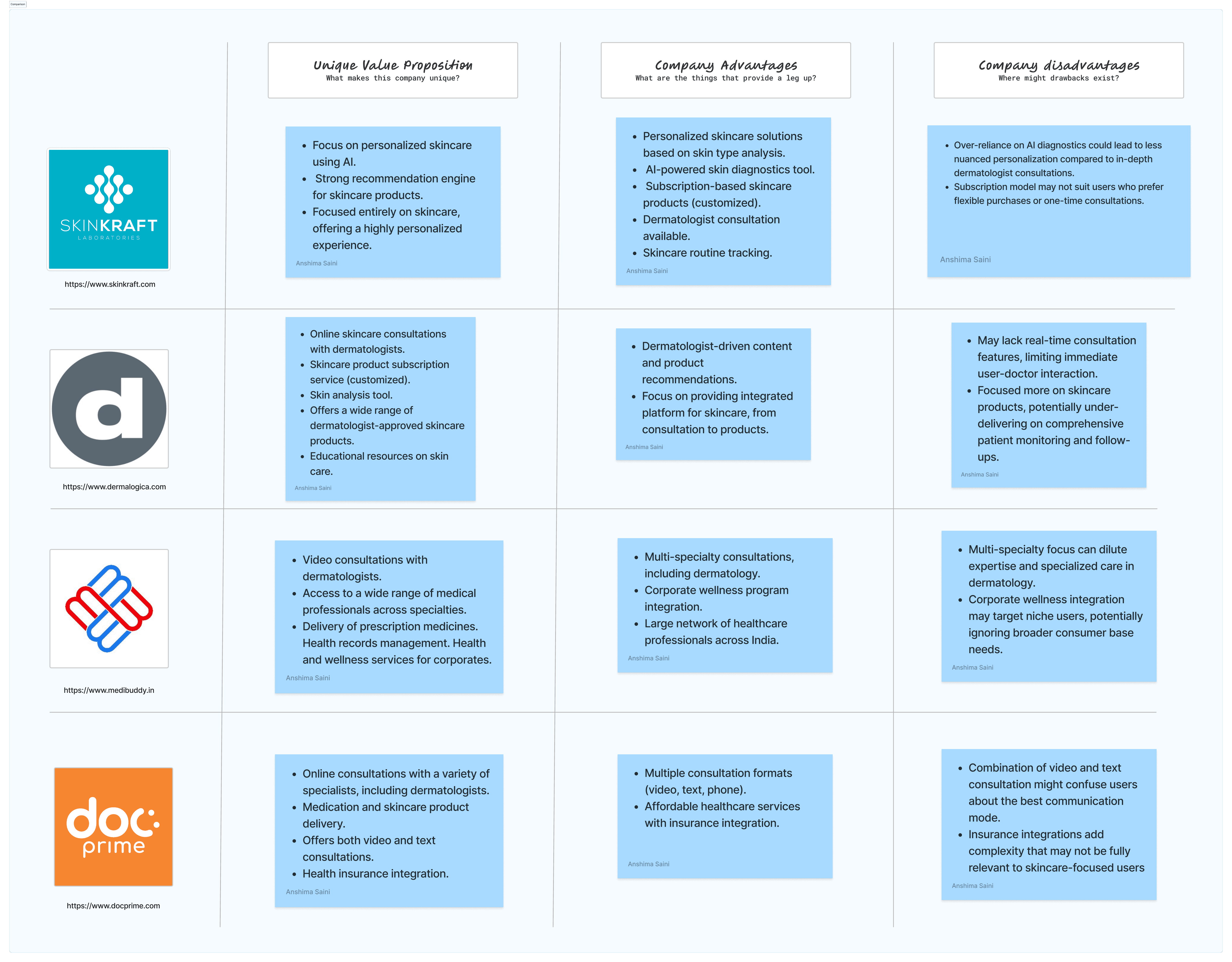
Competitive Analysis
It guides user experience improvements by analyzing competitors’ features, user pain points, and industry trends.
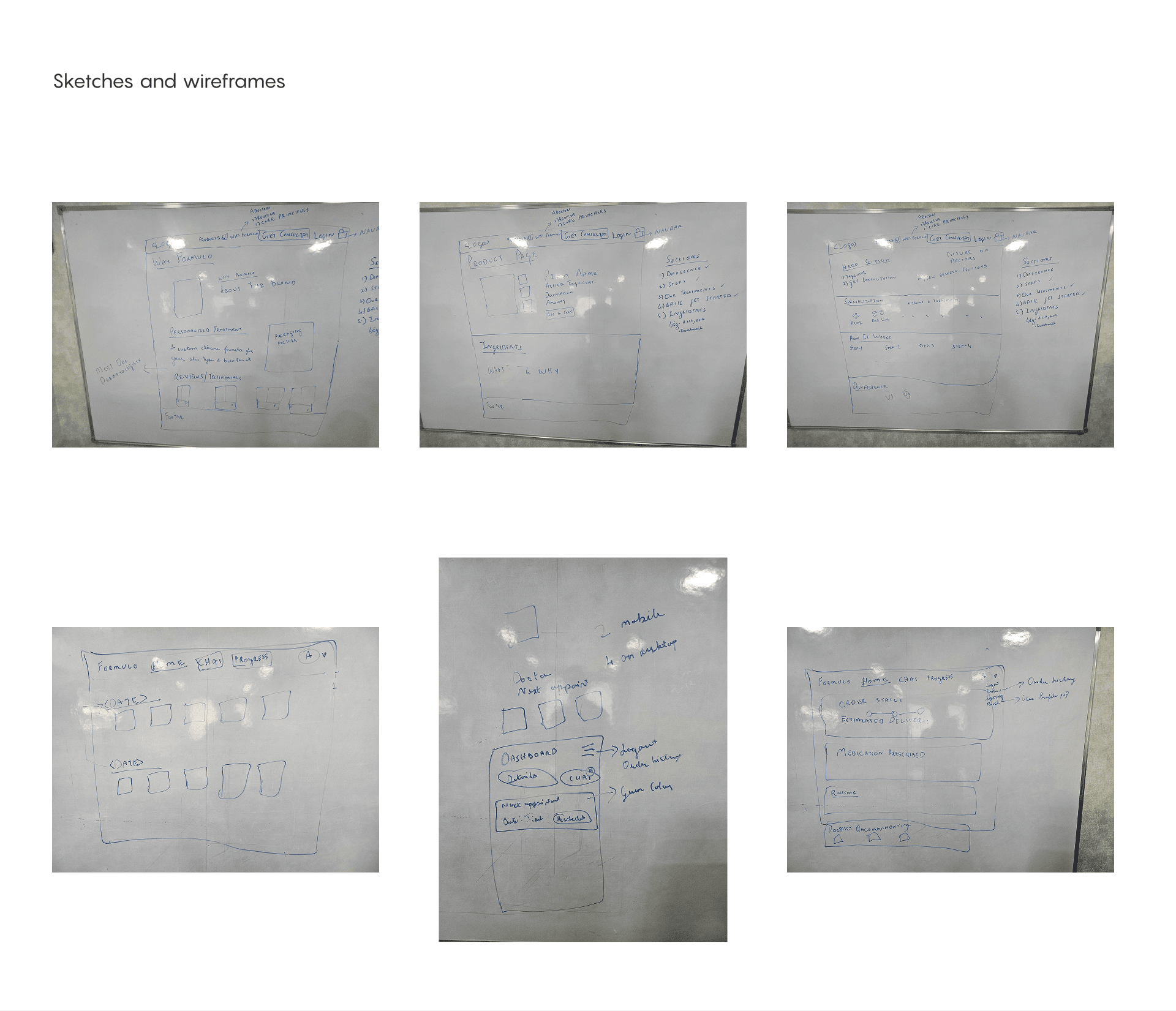
Paper Wireframes
Paper wireframing is a quick and accessible method in UX design where designers sketch basic layouts and screen elements on paper. It helps visualize the structure and flow of a product early in the design process without getting distracted by colors or detailed visuals.
Impact
While exact quantitative metrics were unavailable, the design direction created a stronger qualitative foundation for usability, trust, and scale.
Improved usability
Reduced workflow complexity
Better information architecture
Scalable design foundation
Enhanced user confidence
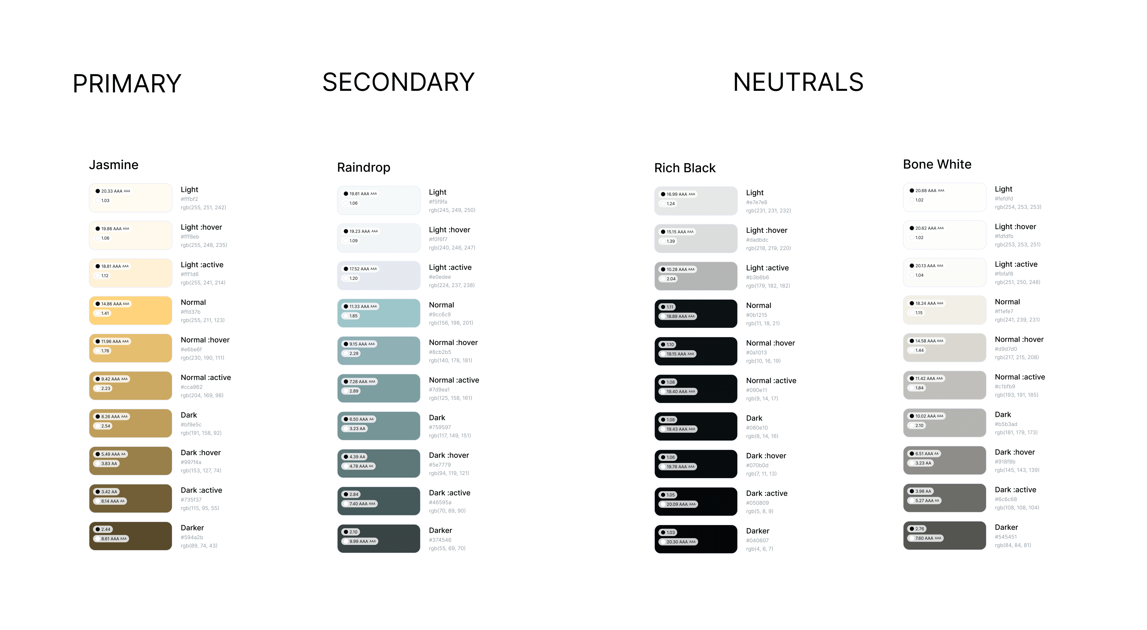
Color Palette
The best final accessibility ratio from the provided palette is 23.03 AAA, found in the "Rich Black" neutral color palette for the darkest shade (#040607). This ratio offers exceptional contrast and meets the highest WCAG standards for readability and accessibility.
What I Learned
Designing for healthcare taught me that trust, clarity, accessibility, and user confidence are often more important than visual complexity. Working on healthcare workflows strengthened my ability to simplify complex information and design experiences that support better decision-making.
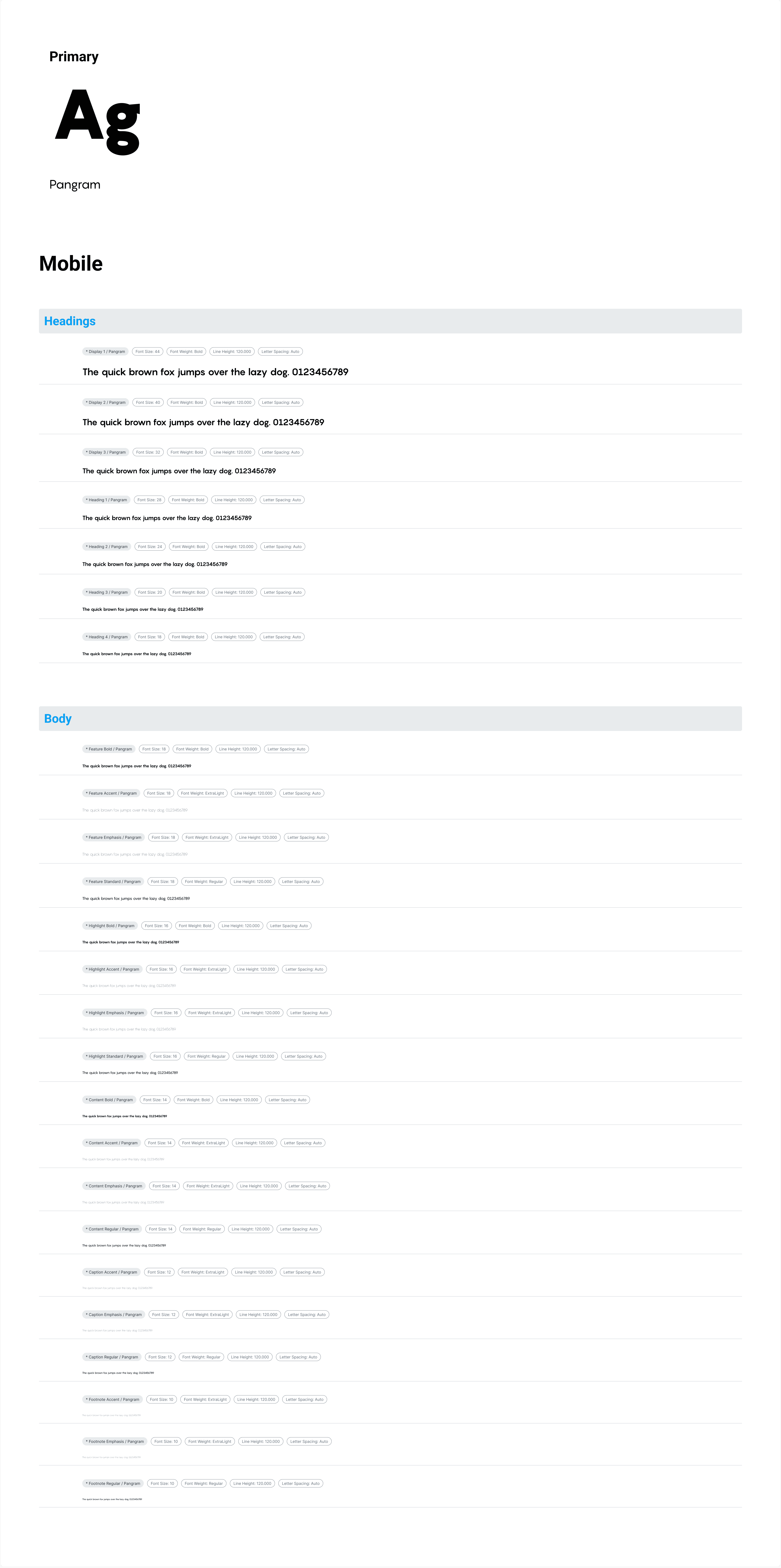
Typography
typography ensures that text is clear and accessible by choosing appropriate fonts, sizes, spacing, and contrast, which helps users easily consume and understand content across devices and abilities.
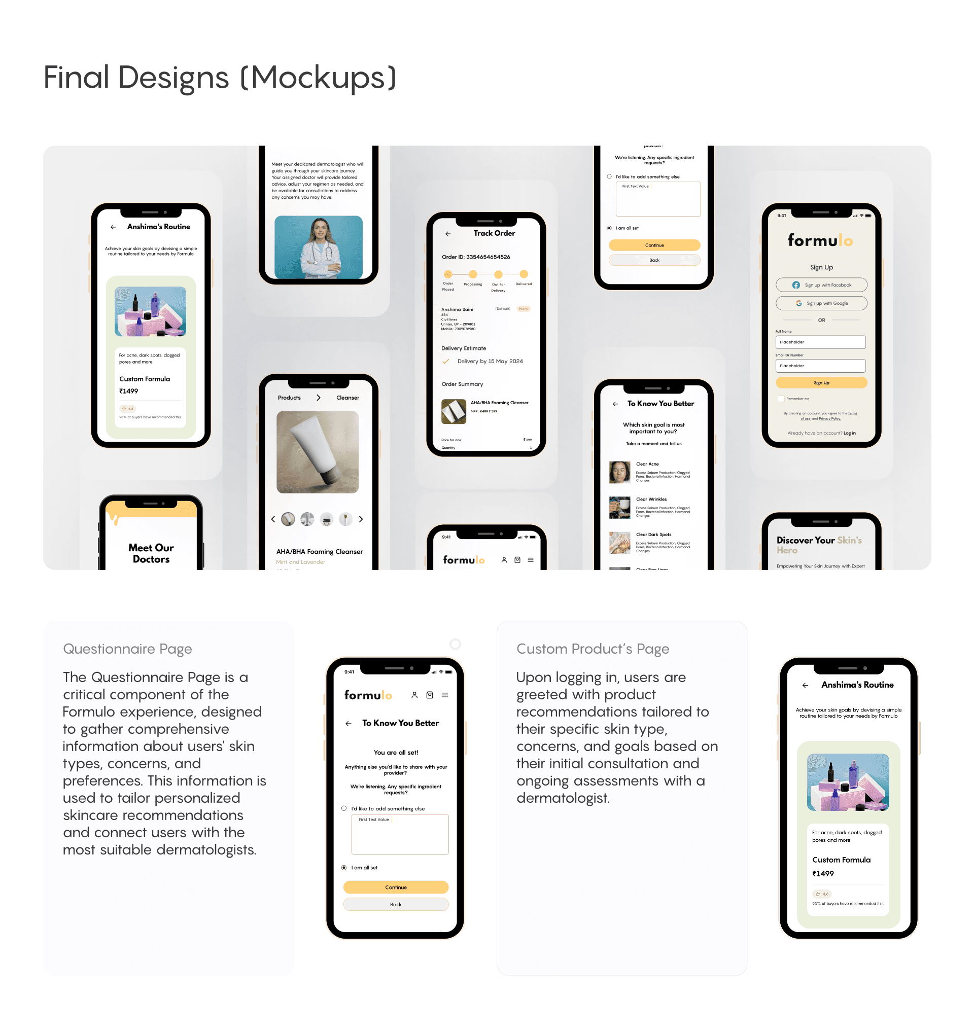
Final Mockups
Objective: Translate the product strategy into screens users could understand and trust.
Decision: Keep the interface clear, accessible, and action-oriented rather than visually complex.
Impact: The final screens support confidence, completion, and a more scalable healthcare product experience.
Ready to build something amazing?
I'd love to connect with you!